Wolfgang Tillmans' installations are what supremely motivates and inspires me as far as his absurdist narrative and installations that defy what is normally accepted in a gallery or museum setting. I always appreciate when artists push the boundaries of the contemporary art world and are successful doing it. His practices are especially inspiring in terms of the work I'm making currently and influences my decision making as far as how I install my work and curate the space.
Wolfgang Tillmans
Monday, April 28, 2014
Artist
I'm not sure if I have featured him in here before, however none the less I feel compelled this week to talk about Richard Prince's work.
I first came to know of his work last year and quickly made the decision that I hated his work and the practice of it. However, in the past 4-5 months my own approach to art has started to shift and as I begin to put together my final for concepts it's kind of symbolic that I talk about the art of appropriation. This semester has been a bit of a journey in relation to the development of my artistic process and to come away from it, appreciating and being to drawn to his work is extremely surprising and signifies a big shift in myself!
I first came to know of his work last year and quickly made the decision that I hated his work and the practice of it. However, in the past 4-5 months my own approach to art has started to shift and as I begin to put together my final for concepts it's kind of symbolic that I talk about the art of appropriation. This semester has been a bit of a journey in relation to the development of my artistic process and to come away from it, appreciating and being to drawn to his work is extremely surprising and signifies a big shift in myself!
Sarah Mei Herman
Sarah Mei Herman's work centers around relationships between people, especially siblings. Her images document the growth of siblings (or other relationshipa) and display their relationships through actual physical contact and proximity to one another.
I would really like to incorporate more of an actual documentation of the current relationships in my family to play with the inclusion of my older images, so Herman's work is something I would like to spend more time with.
I would really like to incorporate more of an actual documentation of the current relationships in my family to play with the inclusion of my older images, so Herman's work is something I would like to spend more time with.
Jessica Berry - Artist
“THTK (2010-Present)”
(Too Hard to Keep) is a growing archive of photos too painful to live with any longer. This repository is a place for photographs, photo-objects, and digital files to exist without being destroyed. Site-specific installations continue to be curated out of the expanding collection.
Participants may dictate whether the photographs submitted to the archive may be exhibited in the future with other submissions or are photographs that are only to be displayed face down.
Tiziano demuro
I think that this artist had some very interesting ideas when it came to collage art. I love the very graphic quality that he creates from the his cutting and layering techniques. I feel like these types of techniques would work well with my current project as it has progressed so far.


Marla Rutherford
Marla Rutherford
I picked Marla Rutherford because often her portraits are unique and stand out. She picks great characters for he po
rtraits and is able to grasp their personality, or what she wants us to think, perfectly. She also uses lighting well, with even tones.
I picked Marla Rutherford because often her portraits are unique and stand out. She picks great characters for he po
rtraits and is able to grasp their personality, or what she wants us to think, perfectly. She also uses lighting well, with even tones.
JOHN DIVOLA
JOHN DIVOLA
I was drawn to the intense lighting in these photos. It gives them a candid feel without looking too like amateur flash photography. I was also surprised to see a similarity with my current series in terms of line and simple composition.
Artist Post - Andie Younkin
What I love about Dennis's work is how he use light to dramatize a situation. He takes a person expression and individuality and just heightens this mood to create a greater feeling in the viewer. His color tones are also so very beautiful.
Friday, April 25, 2014
Artist Post- Amber-Lynn Taber
Lisa Anne Auerbach
American Megazine
So it's this giant magazine that's five feet tall, two people flip the pages and the wear shirts the artist has made that say "Bigger" and "Better" respectively. There are currently two editions. The first one, being shown at the Ski Club gallery in Milwaukee right now shows megachurches from Auerbach’s travels. The second edition is on display in the 2014 Whitney Biennial features photographs and conversations from the artist’s tour of the storefronts used by psychics around Los Angeles. The size the magazine is printed at directly questions the American fascination with the bigger.
Wednesday, April 23, 2014
Andrew Wyeth & Adriana Duque
I'm picking two artists because I've been a bad student, and we kind of talked about one of them last class.
Andrew Wyeth
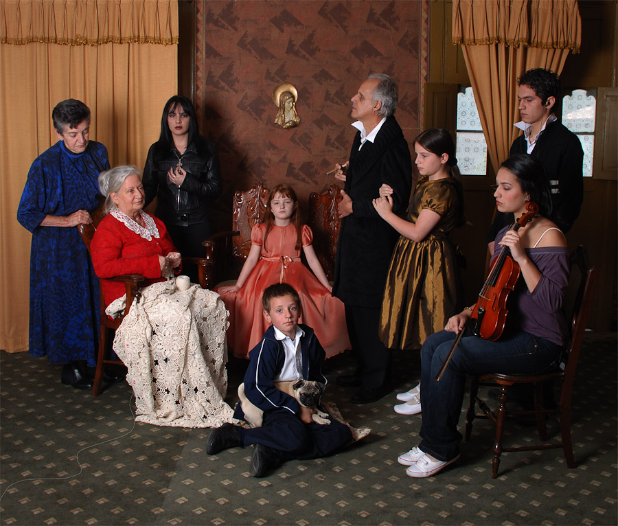
 Adriana Duque often works with the idea of childhood and the magic that is typically associated with it. She also has a way of photographing in a formal manner that blatantly references the traditional clothing, lighting, and posing of historical paintings. I find that I would be interested in incorporating a bit of this style into some of the more formal portraits I've been working on for my work in this class.
Andrew Wyeth
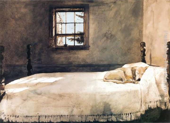
We mentioned Wyeth's image Christina's World during my critique on Monday, and I've found myself seeing home in many of his paintings. The images feel like memories, and I can easily create the smells and sounds that exist in his spaces. Thank you guys for mentioning him to me!
 Adriana Duque often works with the idea of childhood and the magic that is typically associated with it. She also has a way of photographing in a formal manner that blatantly references the traditional clothing, lighting, and posing of historical paintings. I find that I would be interested in incorporating a bit of this style into some of the more formal portraits I've been working on for my work in this class.
Monday, April 21, 2014
torbjørn rødland
torbjørn rødland
I enjoy his subjects and subject matter. Also the way he crosses into the out worldly while still being grounded in reality intrigues me.
Nadav Kander
I enjoy Nadav's landscapes because of the space that is left for the viewer while still invoking emotion
BOB MAZZER
BOB MAZZER
These photos are from Mazzer's "On the Tube" series, in which he spent two decades documenting people in London as we commuted to and from work. He used a 35mm camera to allow for quick shots. Even though these were taken quickly, he was able to render the composition and lighting in a unique and mood effecting way.
Sunday, April 20, 2014
Josh Wool
Josh Wool
Josh Wool mostly works with portraits, lifestyle and fashion. My favorite photos of his so far are the ones in black and white. According to wool, he generally uses only natural light, which he finds “more dynamic.” “When you’re just sitting with someone and you’re in a chair, they’re in a chair, you’re having a conversation and you just happen to be taking pictures, that’s when the best photos come out—at least for me,” he says. His work was in a pair of pop-up exhibitions in Nashville organized by Joint, which showed emerging photographers alongside greats like Richard Avedon and Irving Penn. That's pretty impressive, right? The shallow depth of field really gets me, like hot damn.
Olivia Bee
Olivia Bee
I actually discovered this artist from the cover of one of the Emeriging Photographer magazine. Though most of her images are fashion-related and mostly aesthetic, they evoke a sense of nostalgia, possibly from the film grain from her film cameras. They are often soft, with a dreamy quality, but she shoots in a variety of different ways. Using double exposure, straight on, fashion/editorial/portraits/etc. There's not really much about her work, but there are a lot of photos she's taken, and I don't know, I just think they're pretty. I don't think that's a bad thing—liking things just because they're visually appealing.
I actually discovered this artist from the cover of one of the Emeriging Photographer magazine. Though most of her images are fashion-related and mostly aesthetic, they evoke a sense of nostalgia, possibly from the film grain from her film cameras. They are often soft, with a dreamy quality, but she shoots in a variety of different ways. Using double exposure, straight on, fashion/editorial/portraits/etc. There's not really much about her work, but there are a lot of photos she's taken, and I don't know, I just think they're pretty. I don't think that's a bad thing—liking things just because they're visually appealing.
Nam June Paik
Nam June Paik's video installation work is currently influencing me in a number of ways. I'm trying to learn from the abstractions and actual video works he made to inspire my work in filmmaking but in terms of this class, I'm taking bits and pieces of his installation structures and trying to find ways to incorporate those methods into my final presentation in this class.
Nam June Paik
Wednesday, April 16, 2014
artist- andrea modica
Andrea's photographs are very beautiful because of the stark black and white style she usually shoots in. The focus on the forms of the bodies of the subjects and the how the light and shadow affects what the viewer focuses on in the photograph, as well as the play on focus is very effective in my opinion.
website
(link sends you to a series of hers i find the most relatable, since i couldn't paste them directly into the blog)
Tim Bjorn - Clayton Leverett Artist post
Tim Bjorn
I first came across Tim Bjorn last year, when I found his video behind the scenes for a Volvo Truck ad photo shoot. Ever since then I've tried to use that video and his other images as examples or benchmarks for my own work and technical skills. His work is what first inspired me to learn more about lighting and how photoshop can help with that process. While these images may just be advertisements, I absolutely love them for their technical prowess, and they have helped me make wonderful things.
"With his unique technical and artistic skills, Tim Bjørn Wahlfried has established himself as one of Denmark's absolute top photographers. When it comes to image-, commercial-, and design photography, he is one of the most used. Tim is able to transform a briefing into communicating photos by creating a clear link between message and composition, with great respect for details. He tells your story from surprising and seducing angles - giving your photo the soul and visual identity that makes all the difference.
Innumerable of people have found their inspiration through Tim Bjørn Wahlfrieds photos, his exceptional exertion for perfection and admirable eye for the utter and expressive picture. His field is advertising, commercials and the unpredictable interior design. Tim Bjorn has encouraged and stimulated his clients from all over the world from his base in Copenhagen for more then 20 years."
Suzanne Heintz
In my search for photographers who worked with families, I came across Suzanne Heintz's series Life Once Removed, which was a surprisingly funny chronicle of Heintz posing with her American Dream family in common tourist locations. "You can't just go out and buy a family. Or can you? I did." Although Heintz arguably goes overboard with the video and paragraphs of explanations, the concept of her work is something I'm attracted to. The irony of her "American ideal" making her stick out like a sore thumb makes the performative aspect of the series stand out. The images are also pretty amusing.
Tuesday, April 15, 2014
Jessica Berry Artist Post
Holly Anstiss
Her LinkedIn
So these are amazingly beautiful and I kind of wish I had seen these before I took the photos that I am showing for critique tomorrow! The compositions are amazing and the use of light.
So these are amazingly beautiful and I kind of wish I had seen these before I took the photos that I am showing for critique tomorrow! The compositions are amazing and the use of light.
artist post
Sharon Lockhart
I was introduced to Sharon Lockhart's work recently, and whilst I'm not a fan of all of her work I have found some of her stuff really useful in relation to my own project. In the image I have shown, you can see that she has chose to install two supposed identical images, printed large together, making the work interact with the viewer in a new way. This is something that I feel could work well with some of my own work at the moment and is an approach I am serious about trying.
Subscribe to:
Comments (Atom)


