Tuesday, November 29, 2016

Wes Anderson and Commercial art (literally)


Many have probably already seen the new H&M ad directed by Wes Anderson, but for those who don't know: Wes Anderson, a major Hollywood director, known for his very specific stylistic films recently directed a 3 minute and 52 second commercial for H&M.

When I first saw this, it kind of shocked me. Wes Anderson is not normally the kind of director who wants to listen to producers and people infringing on his art, but here he is directing a literal commercial?! It doesn't get any farther away from art than that... right?

It seems I was wrong. The commercial is less of a commercial, and more of a short film with H&M's logo on it (and costumes supplied by the store as well). And I found this to be very impressive. Many films have product placement in order to pay for the film, which makes sense. Movies are expensive, and they have to be paid for one way or another, but having product placement often times takes me out of the film and reminds me that it's all a money game. Having the film already be a commercial though, is another story. Every time I noticed a product or the H&M ad, it strangely only took me further into the film. The film was about a holiday spent on a train car, and oddly enough, the ad being about clothes and things that people will buy for christmas only put me more into the christmas spirit. The product placement and the film actually strengthened each other.

Through all of this, Wes Anderson was still able to (at least from what I could tell) keep all of his directorial integrity. It seemed like every decision was made by him in a very calculated manor, and there were only a few times that I imagine he would have done something differently.

It was an extremely refreshing commercial to see, and based on its popularity I have a feeling that we are going to see a few more commercial films like it in the future.


Georgia O'Keeffe nature paintings

Georgia O'Keeffe was an American painter and one of the first female painters to achieve worldwide acclaim from critics and the general public. Her work represents nature in a innovative impressionist way that challenges perceptions. There is a heavy focus on color, shapes, and how she turns them into a composition that successfully represents the natural subject matter while also appreciating its form and color. This reminds me very much of what I am trying to accomplish with my work. O'keeffe is creating beautiful works by simply appreciating forms in nature and representing them in a abstract way. In my last video it became clear to me that over complicating the transitions takes away from the forms and colors I am trying to appreciate. O'Keeffe simply represents these forms with no distractions or complications. 

Richard Wentworth's False Ceiling at the IMA


I went back to Indianapolis, Indiana for Thanksgiving break and visited one of my favorite places, which also happens to be my workplace, the Indianapolis Museum of Art.  Every year the IMA invites an artist to create a piece in the main atrium/lobby area for guests to view as they enter the museum.  This time last year Richard Wentworth, a British artist, installed a ceiling of books, which he entitled False Ceiling, in the lobby. This time last year, I was able to attend the artist talk and hear him speak about his work.  He was a very charismatic man and cracked a lot of jokes.  Wentworth spoke intelligently about his work but kept the audience on their toes with his wit.  


When I went back to the museum this past weekend the ceiling of books had been removed and the next installation is in the works.  Thinking back to his artist talk made me think a lot about how I can improve the way I speak about my own work as an artist and a person.  

Cristian Lutz - Insert coins

Las vegas is one of the cities that everyone wants to visit at least once in their lifetime. we can visualize clear image of the city even if you've never been to the place. To me, even if i never been to that place, when i think about las vegas, i think about casino, parade, and humongous hotels; it's the city that's full of pleasure and excitement. However, on the other side of bright city, it provides new perspective on las Vegas.

Las Vegas' unemployment rate is around 14%. Like there are many heavy spenders in Las Vegas, there are many bums. Swiss photographer, Cristian Lutz photographed dark and corrupted part of Las Vegas for three years. The name of the project is Ins coins; as a person put in more coins into casino machine, one's pocket gets lighter.


http://christianlutz.org

^here is the link to his website.


Monday, November 28, 2016

tips for organizing your photo book


The article covers these tips:

Tell A Story By Choosing A Theme
Curate Your Images Before Uploading Into The Editor
Select A Style That Suits Your Story
Display A Single Image Per Page
Personalize Your Title
Don't Worry About Putting Your Photos In Chronological Order
Tell Your Story Through Color, Tone And Texture

Even though these were made for weddings I think that the tips are broad enough that it could help with any book form!

Click here to view the tips

but after reading through them I also got to thinking how the book could grow from breaking a few of the rules. Displaying multiple images per page, not giving it a title, leaving blank space, letting the theme grow after placing the images. I have been spending a lot fo time thinking about the order fot he pages in my book and chronologic order, and I love how my book grew out of my focus on other things I wanted to work on vs. making it a cohesive "order". I think that the oder came naturally and placement on pages have been helping guide the eye from page to page. I can't wait to use these tips to edit my book, thought everyone else who's interested in artist books would like to read over these too!!

Moholy-Nagy: Future Present

Over break i went to The Art Institute and they had a retrospective on Laszlo Moholy-Nagy... and oh my god was it fantastic!

If you guys haven't read about him or seen his work i would highly suggest that you check it out. He believed in working with the materials that were present at the time, and he was making art during WWI and the industrial age. and he was part of the Bauhaus movement, and he started the New Bauhaus school in Chicago.

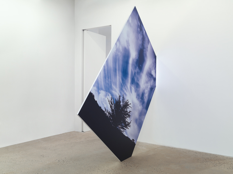
His ideas about art and the way that his work is displayed really gave me some inspiration for how to go about installing my own work for the final. This exhibition also showed me a lot of "strategies" to deal with "rest" in my work. and i think that i've primarily been thinking about rest as an afterthought that comes with installing, so i'm going to try and be less chaotic with my images and see what happens.


Painting, photography, film, sculpture, advertising, product design, theater sets—László Moholy-Nagy (American, born Hungary, 1895–1946) did it all. Future Present, the first comprehensive retrospective of Moholy-Nagy’s work in the United States in nearly 50 years, brings together more than 300 works to survey the career of a multimedia artist who was always ahead of his time. Moholy, as he was known, came to prominence as a professor at the Bauhaus art school in Germany (1923–28). In 1937 he founded the New Bauhaus in Chicago, a school that continues today as the Institute of Design at the Illinois Institute of Technology. He remains the most renowned international modern artist ever to have resided in Chicago.
A pioneer of abstraction for the industrial age, Moholy insisted that art must be developed from the materials of one’s time, in his case recorded sound, photography, film, and synthetic plastics. He demonstrated that in our era of reproducibility works of art gain fresh meaning with a change in size or even reorientation, reverse printing, or a shift in lighting. For Moholy, every citizen could be creative, and every viewer could educate his or her senses by studying effects of light, transparency, and motion in common materials of everyday modern life.

Future Present presents a wide body of works ranging in date from 1920, when the artist moved to Germany, until his death in Chicago in 1946. One room shows 38 photomontages—nearly all known compositions in nearly every physical variant—brought together for the first time. Another presents three “telephone paintings,” a single abstract composition that Moholy ordered in three sizes from an enamel sign factory in 1923; this trio of industrial paintings has been separated for decades. All six of Moholy’s iconic, plunging views from the Berlin Radio Tower are united in another room, while a multimedia installation, Room of the Present, which Moholy conceived in 1930 but could not finish, is brought to life as a room of its own.


Special emphasis is given to Moholy’s time in the United States, where his art moved from planar painterly abstractions to three-dimensional hybrids of painting and sculpture. Never have so many of the artist’s late works in Plexiglas—wall-mounted, freestanding, and hanging in midair—been seen together. These works came from Moholy’s teaching at the “Chicago Bauhaus,” which is also highlighted through a showing of student work as well as a “teaching wall” that frames Moholy’s greatest pedagogical ideas. The show closes with Moholy’s recorded voice and a projection of abstract color slides that the artist made in part by recording the scribble-like trace of headlights and taillights on Lake Shore Drive at night
If you guys get a chance to visit Chicago before January 3rd, You should check this exhibit out! (Art Institute is free on Thursdays)


5 Photographers Examining Masculinity

http://www.hungertv.com/feature/five-photography-series-challenging-the-construct-of-masculinity/

The article I linked above describes and shows the work of 5 photographers making work on the subject of masculinity. I found this article, aside from the work itself, to be an interesting comment on masculinity(how it manifests itself and who it may effect.) Each of the photographers made work on one semi-specific group of men. Be it a certain age, sexual identity, body type or what have you. None of the photographers were necessarily making work to serve as a definition of masculinity but rather more as an examination.
                             
Image result for sophie day Fuck Boy

I thought it was interesting that 3 of the 5 photographers written about in the article are women, photo above taken by Sophie Day in a series called Fuck Boy. The work does not necessarily serve as a critique of the subject, 15 to 18 yr old boys, but rather showed aspects of adolescent boy culture that may be considered unsavory to the public. Its real in that these boys lead lives similar to many adolescent men in the United States but I think it doesn't properly show the nuances that exist in even the still developing mind of a teen male. 
        I at one want point was living similarly to how one of these teens Day photographed might be living. however, I also believe that  based on how i was raised, specifically by my fathers example, my definition of masculinity may be one that is a little different than societies as a whole. I want my work to really push that idea, I also want my work to show that although we try to define masculinity in a very clean way as a society from person to person their relationship with masculinity and how they define it will very.  
  

Letha Wilson


A while back I got an e-mail from Shane that just read "Also, Letha Wilson" and a link to her website. She utilizes different mediums and interacts with the space in a way that I would really like to explore in future work. Much of her work is a conversation between the natural and architectural world, photograph and scultpure, a new take on the "landscape photograph" - and her installations always feeling a bit intrepid.
Wilson was featured among many other artists I admire/am inspired by in What is a Photograph? curated by Carol Squiers - including Mariah Robertson, Alison Rossiter, Marco Breuer, Matthew Brandt, etc. These artists all push the notion of what photography can be, making photographs into objects, taking up space - experimenting and reimagining. Wilson, among these others, inspire me to continue researching and learning new ideas and techniques. Photography in it's many forms can be an adventure - a journey into memory, an exploration of new worlds -  and that is how I hope to continue my work as well.

Shirin Neshat's "Turbulent"

Shirin Neshat is an Iranian film/videomaker, who also does work with photography. Her work is known to bring together contrasting subjects, the contrast between Islam and the Western world being her most talked about one.

I've known about her for a little while now, but recently I took the time to re-watch Turbulent (1998).
It got me thinking about the concept of showcasing such duality in a work, and it especially made me think of how I could further push that concept in my own video pieces - in my case, I guess the duality of reality and abstraction. Aside from that, Turbulent is such a strong piece and so so powerful in its ways of of music and emotion to represent gender and it's complexity.

https://www.youtube.com/watch?v=f2DNMG2s_O0

Sanja Marusic

Ok, I normally wouldn't gravitate towards photographers with a tumbler aesthetic but i'm going to make an exception for this one. I was looking at GUP Magazine's blog and I stumbled upon this lovely woman names Sanja Marusic. There's not much information about her work flow or her concepts online but I do view her as a very inspirational woman. Just two years after undergrad she got signed to a photography agency and has her own gallery. GOALS! Her work, as a whole, is beautiful. I did find an interview with her online where she talked about not liking surrealist work even though most of her work has some form of surrealist element to it. I can relate to that with me not wanting to have feminist undertones in my work but somehow always making them. The heart wants what the heart wants I suppose. My favorite series I found by her is titled Moonscape Island. In this series she focuses more on the landscapes her models are interacting with than the models themselves. Its like the models are the props and the landscapes are the main subject. She creates this world that seems oddly seducing to the viewer. This could just be her color pallet or her use of lighting, I'm not entirely sure. However, I do know that I will be revisiting her work as inspiration for later projects.

http://www.sanjamarusic.nl


Tuesday, November 22, 2016

Analyzing vs Taking A Stance

During the Daniel Shae lecture I found myself not quite satisfied with a lot of his answers. I felt like I might of been in the minority in that opinion based on a few different talks about it I participated in afterwards. I actually really liked his work, and found him to be competent and expressive about what drove him to make certain work. I felt like since it was so close to the election I may have been viewing it through a very augmented lens. He mentioned his work was political in nature and I suppose I expected more along those lines, and I believe his completed piece would have fulfilled my expectations for politically motivated art. The only criticism I had on his work was the cruising/construction site portion. I appreciated his honesty in admitting he just thought it was funny. It felt like that needed his personal viewpoint on the issue to carry any meaning.

What struck me was his analytical stance in his art. That is something I really appreciate normally, and strive to do in my own work and life in general. But for some reason on that day, that really bothered me. And I really think it had to do with the election and the headspace everyone was in. It was through no fault of his own that I found the method of observing and not taking a stance on issues infuriating. As I do whenever I feel something too strongly, I attempted to check myself first for the answer. I'm quite positive what bothered me about it was that I often don't like taking strong stances on things. I prefer to keep messages remote so anyone could potentially identify with them. I'm the type that sleeps on emotional actions to see if they are still there in the morning. I think this lack of engagement, by me and many others, is the essence of what's been wrong with how we interact with each other. This provided me with the urge to include more of a difinitive meaning to my work, words, and actions. I will always continue to analyze things from as many viewpoints as possible. But it's become clear to me we need more action than observation lately. So I'm going to try to incorporate that feeling into my future endeavors.

46.5°N by Anastasiia Chorna


I came across Anastasiia Chorna in an article and I was very intrigued by the title. Chorna says that 46.5°N is the latitude of two cities that she has deep admiration for: Odessa, Ukraine and Lausanne, Switzerland. She set out to capture the obvious differences and similarities between the two towns. This set of work stuck out to me because I have never been to either of these places, but I am drawn to the images because of the thought and obvious passion behind the work. It reminded me, even though I often question if people will be interested in my work at all, that the viewer can be compelled by the images more the the overall idea of the work.
I think that this series is really interesting because it has a mixture of black and white photos and color. It gives the work a sense of time passing. Even though you can't tell which photo is from which town, there is a fluidity to the work. I am interested in this idea of comparing different places that you feel strongly about. I've often thought about going to Petersburg in thought of sparking connection with it's neighboring city that's my home town (Richmond).